PROBLEM
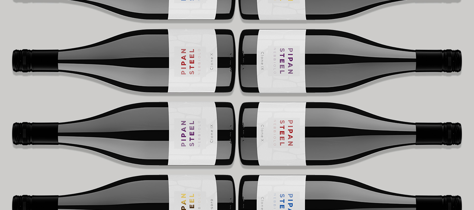
Pipan Steel approached us looking to add depth and improve perception and finish of their brand - from the presence required of their 4x award winning Nebbiolo wine bottle labels to the UI/UX of their online shopfront.
- Seeking high-end look & feel
- Quality stock choice
- Premium finishes
- Australia's premium label finisher
CHALLENGES
The wine market is notoriously fickle. A label that is expensive to produce will not necessarily bring the desired results to your wine brand if the design does not echo the sentiment. Likewise great design needs to be supported through great stock choice and finishing. Working with someone that has done it all before and understands the nuances, like us, can make this process a considered one.
"The new labels have been receieved incredibly well by all of our suppliers and reviewers that have had early access to our 2017s"
Strategy Session.
A strategy session was held onsite at the winery in Mudgegonga, NE Vic so we could experience the brand. Hopes and goals, likes and dislikes were uncovered. Black/white? Bright/subduded? Classic/contemporary? Textural, Raised print, Metallics, foils? Embossing? Samples were used to illustrate and we left with a distinct direction.


Plan of Action.
Capability and feasability discussions with specialist label finishers in Melbourne followed. On a job like this, everything discussed was possible, both conceptually, and on time and budget. A timeline was established and phase 01 of the design process was underway.

RESULTS
The new labels and site have elevated the positioning of the brand, allowing Pipan Steel to make the seasonal price increase with renewed confidence in their brand and a new look to broaden market appeal.
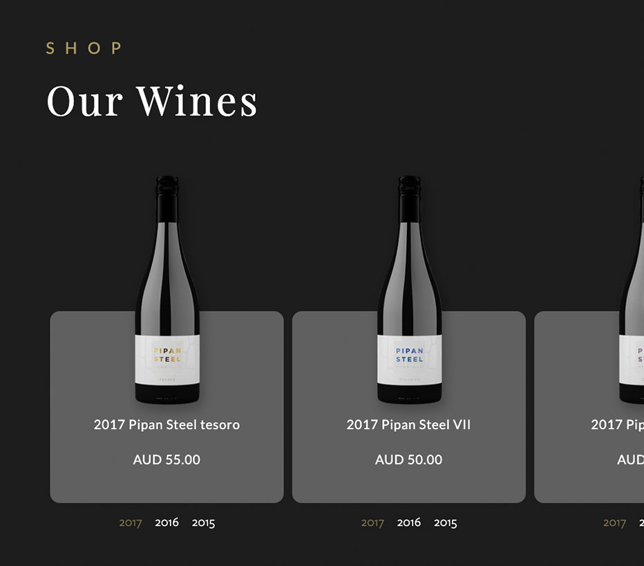
- Fresh eCommere D2C store
- Enhanced product filtering options
- Full screen looping video
- Photorealistic bottle mock ups
Check out Pipan Steel yourself here pipansteelwines.com.au
Have an idea?
Let’s get it done right!

Mark Brown
Director, Envato

Mark Stewart
Operations Manager, Envato

Michaelle Dawn
Art Director, Envato
00 / 00

